
- Data is a part of everyday life and influences our understanding of the world around us. The production of data is rapidly increasing, with no signs of slowing down – currently, the world generates a staggering 2,500,000 terabytes of data every day.
- But it’s how we deliver this information that really impacts what people do with it, and that’s where data visualisation comes in.
- Visualisations can help to communicate data in a way that makes it intuitive to understand. It is a skill that is growing in demand – according to Google Trends, searches for ‘how is data visualisation used’ grew by more than 750% in the last 5 years.
- Edward Tufte, a pioneer in the field of data visualisation, said that “the essential test of design is how well it assists the understanding of the content, not how stylish it is.” So, data visualisation is definitely something we should be getting involved in as public sector content designers. In this blog post I’ll be exploring some of the ways we can do this.
Finding opportunities to use data visualisation as content designers
Influence your team’s decision making
- We can work with data analysts in the same way we work with subject matter experts (SMEs) – challenging jargon and helping to make complex information easy to understand.
- Once we understand the implications of the data for the work our team is doing, we can use data visualisation to play back the information in an actionable format. This will help our teams make better decisions, resulting in better products and services.
Influence stakeholders
- Charts are frequently used as visuals in presentations to stakeholders. We can help make sure these data visualisations are communicating the key messages we need them to, rather than just being something nice to look at.
- We can also ‘nudge’ stakeholders to make decisions by using carefully designed data visualisations. For example, using colour to draw attention to the most important aspect of the data we want them to take away.
Inform your content strategy
- In a blog post for Content Design London, Ian Ansell (Senior Performance Analyst) explains how he used a technique called cluster coding to visualise connections between various pieces of content. This was used to help Citizens Advice iterate their content strategy.
- As content designers, we should be looking for innovative ways to use data visualisation to help us make evidence-based strategic decisions.
Communicate information to users
- A key part of our role as content designers is to decide what sort of content will best meet our users’ needs. This could sometimes be a data visualisation, so it is important to have an understanding of what type of visualisation would be best to communicate your data in a way that is simple to understand.
A content design approach for creating data visualisations
Defining the intent
- In a case study about co-designing engaging and accessible data visualisations for IPCC reports, the authors emphasise the important first step of establishing the intent of the visual. This should be a short, plain language sentence that summarises the goal of the data visualisation.
- As with any type of content design, you should find out everything you can about your users using whatever evidence and data you have available. This should inform the intent for your data visualisation.
Creating the visual
- Once the intent is clear, you can start to plan the information hierarchy for the visual and create prototypes. Depending on the subject matter and complexity of the visual, it might be useful to pair work with a data analyst or another SME.
Getting feedback
- If you need to get feedback from multiple stakeholders, you can run crit sessions. These sessions should always refer back to the intent of the visual and you should push back on any suggestions that are not aligned to it.
Testing with users
- You should test your visuals with users, so you can be confident that they understand the intended message. For a visual for an internal show and tell slide, this could just involve asking a colleague to look at the visual and explain what it means.
- For a visual that communicates information to external users, you will want to do more thorough user research with each iteration of your prototype.
Different types of data visualisation
Charts
- Charts are the most common way to present data in a visual way. Deciding you need a chart is just the first step – you need to understand what kind of chart will help your users to understand the data. You can use the visual vocabulary tool to help you select what type of chart is most appropriate.
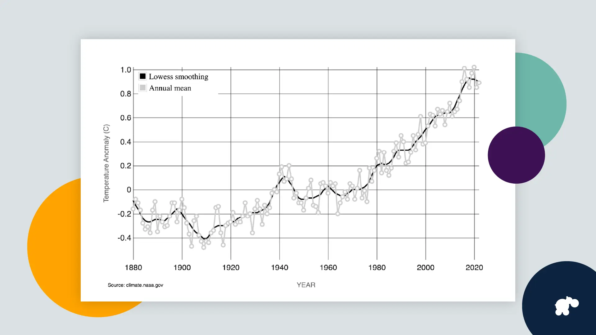
- This Global Land-Ocean Temperature Index line chart from Nasa shows the change in annual mean global surface temperature between 1880 and 2020.
Dashboards
- A dashboard can display a collection of carefully chosen data visualisations, showing a high-level view of your team’s most important metrics. It can be a valuable tool to help you make decisions and measure progress over time.
- Dashboards can also be an effective way to communicate important data to members of the public.
- As content designers, we can help design dashboards that clearly and efficiently communicate the data.
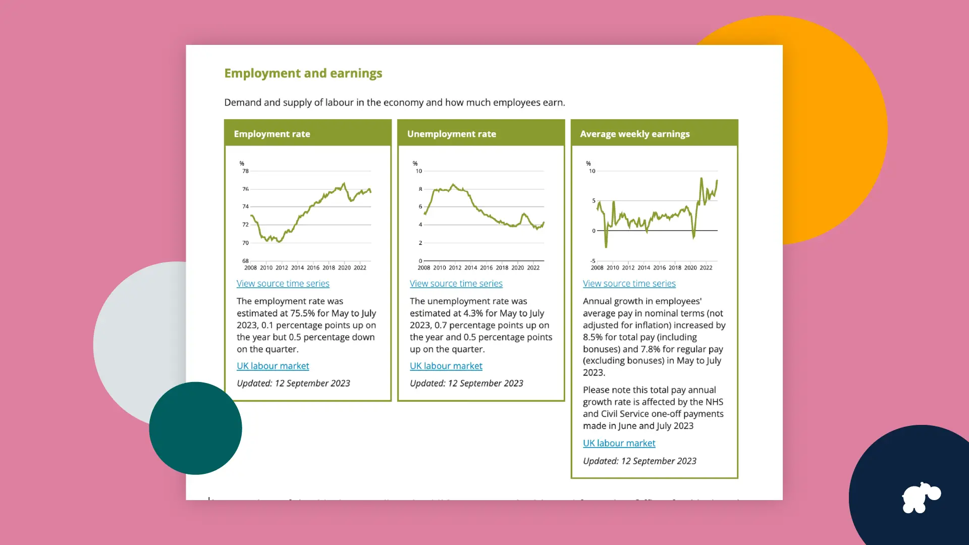
- A snapshot of the Understanding the UK economy dashboard from the Office for National Statistics. Under the heading ‘Employment and earnings’, it displays 3 line charts showing employment rate, unemployment rate and average weekly earnings between 2008 and 2023.
Infographics
- An infographic tells a story using imagery and text alongside data visualisations. When used appropriately, they can be an effective way to communicate complex messages.
- However, creating a high quality infographic takes a lot of time and requires skills in graphic design software, like Adobe Illustrator. You should have evidence of a clear need for data to be presented as an infographic before you decide to create one.
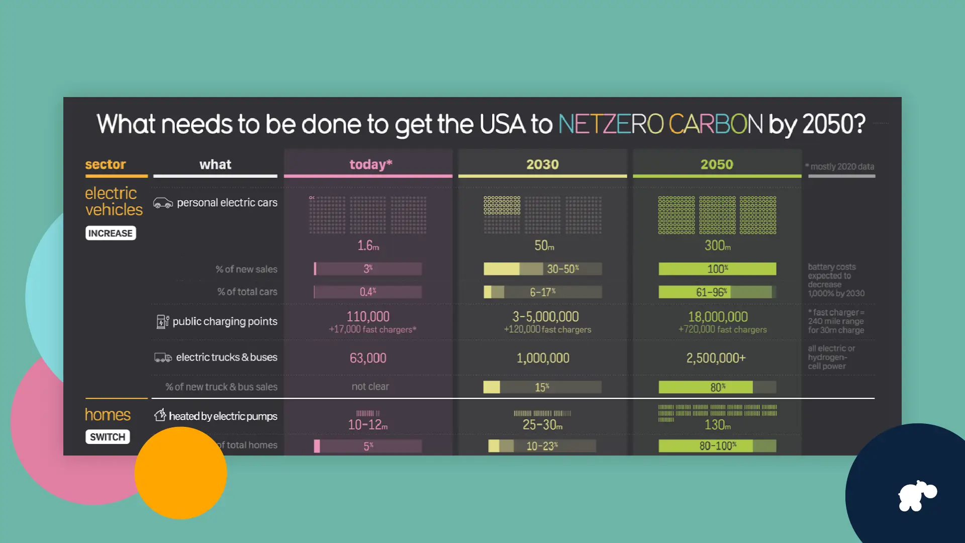
A snapshot of an infographic from Information is beautiful visualising how to get the USA to net zero carbon by 2050.
Make sure data visualisations are accessible
- As with any content, you need to make sure that the data visualisations you create are accessible.
- The Government Analysis function has published a checklist to help you make charts accessible, with sections for different types of charts (for example, bar charts).
- how to create charts that communicate messages clearly and with impact
- best practice approaches for formatting and publishing data visualisations
- how to make data visualisations more accessible to all, regardless of health condition or impairment
- If you want to learn more, I would recommend their free Data Visualisation e-learning. It covers:
Final thoughts
- I will be looking for opportunities to use data visualisation more often in my next project. I would love to hear more about how other content designers use it as a tool in their work – leave a comment below or get in touch.
Share this article: 


