
One of the biggest differences between content writing and content design is how we approach language. Writers are often bound by seemingly immovable laws of grammar, where you might insist on telling people to say ‘fewer’ when almost everyone else says ‘less’.
Content design tends to favour a more flexible approach, where it’s more about someone’s understanding of language instead of ‘the right way’ to say something. You only need to look at when the NHS started using ‘pee’ and ‘poo’ to see one of the most notable examples. Despite accusations of dumbing down, it allowed more people to access and understand their service.
Language changes quickly. ‘Vax’ became Oxford Language’s word of the year in 2021 after receiving 72 times more frequency of use from 2020 (no surprises there). In a similar way, ‘doomscrolling’, ‘PPE’ and ‘livestreaming’ are all examples of words that, for better or worse, have recently been adopted due to common usage.
Language is a great – and sometimes not so great – reminder of who we are and where we are. And because it’s always changing, a content designer should never really feel they know it all.
How government services use language
One of the great things about working as a content designer in government is that we recognise how important it is that users understand the language we use. Design patterns, style guides and case studies can all assist you in what to say and when to say it. But what happens when a service you work on is not covered by existing learning?
I recently started working on a service that was slightly different in that it was new, outside of ‘business as usual’ and involved trialling techniques and processes to gather and investigate information.
Soon, these new techniques and processes started receiving new names. This is how language works, after all. So this was not surprising, but these decisions needed validating to make sure the language used was:
- accessible
- understandable
- commonly understood by users
This was to make sure that anyone new to the service could understand and use it as quickly as possible.
My approach
The first step was to test our internal users’ understanding of the new terms being used on the service. This was to see if they had a shared understanding.
Some of these went against the Government Digital Service (GDS) and department content style guides. Others applied to things that were not yet well defined. Even the working title did not cover the process in an accurate way.
Thankfully, the GOV.UK Service Manual offers a framework for the effective naming of services. Beyond that, we needed to consider how external users would react to the service name when presented with it.
What this meant was a lot of research.
Finding out what we need to know
It became clear that our internal users were willing to help with research, but their workloads made it hard to schedule sessions. Other requirements were that our users:
- could not be influenced by others in their answers
- would have to join in remotely
- needed to take part at a time of their convenience
Other issues came from digital access. Government departments have an approved list of tools that can be used, some of which are unavailable to contractors and some that require long request processes.
This meant a narrow set of options became even more focused. What’s more, whatever solution we chose had to explain the process clearly and do so without confusing them or boring them to tears.
The plan
I sought help from my colleague Ricardo, one of the best user researchers I’ve worked with. As well as always having thoughtful answers to questions presented to him, he’s brilliant at human understanding and, most importantly, will tell you if a process is too painful, dull, or annoying to complete.
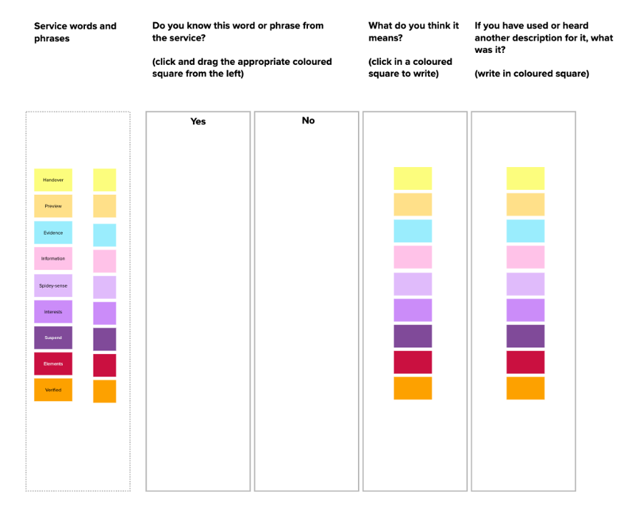
Together we discussed a solution that would present a series of terms that were gained from the service and through observing previous user research. Each user would be presented with a word used on the service. They would:
1. Answer yes or no if they knew it from the service.
2. Explain what they thought it meant.
3. Suggest an alternate word or phrase that they had heard or used.
This would allow me to see how commonly used these terms were, if there was a shared understanding and if there was a better suggestion or another term in use.
A remote survey tool seemed the obvious answer, but this was soon discounted because the set-up would be complex and the process would be really dull (it’s important to keep people engaged!).
The solution
I chose an online whiteboard tool as it would allow me to create individual frames for each user on one large board. The information could be presented in an engaging way, and the task should be fun to complete. Or at least more fun than a survey (a low bar, but all successes should be celebrated).
A unique board was then created for each participant with instructions that would allow them to complete the task at their leisure.
Once a user had completed their research, the frame could be hidden to avoid any other users being influenced by their answers.
It looked like this:
The results (or why we didn’t call it ‘Batman’)
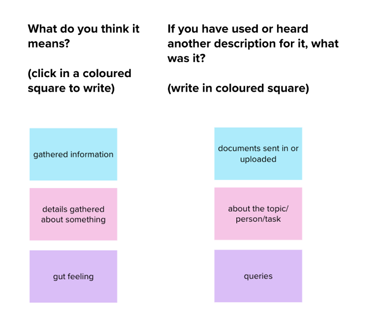
Some of the simplest terms were too vague. ‘Information’, for example, may be one of the most commonly used words, but in the context of this service, it was too broad and not very well defined. Was someone referring to what most people describe as information or a new definition with a capital I?
However, some of the vaguest terms were easy to understand. ‘Spider-sense’ may not be familiar in everyday language, but the impact of Marvel’s web-swinging superhero meant almost everyone understood it as an instinctual, gut feeling.
Unfortunately, using a term that originates from a story about a boy getting superpowers from a radioactive spider is not the kind of thing you want hanging over your service. One user even summed its inappropriateness up by using ‘Batman’ as an example of another word with similar meaning. Ouch!
There were other examples of words that everyone understood but that perhaps needed a more consistent definition. These were encouraging results that would only get better as the service develops. But perhaps the biggest lesson was one I knew but often forget: that language and communication change all the time, and the role of a content designer is to keep up.
You can have all the books, learnings and style guides as you want, but it’s users who really decide their worth. This is just one of the many things I love about my role. Language is always changing, and so should we.
Learn more about our approach to user-centred design at Hippo. Interested in joining the herd? Take a look at our careers page.