We’ve all got our own personalities — the thoughts, feelings and behaviours which make us unique. Some people are referred to as having a ‘big personality’ as if more extreme personalities (whatever they are) are inherently better.
As public sector content designers, I’ve always felt that we should put our personality to one side when we write. But is that always the best approach?
This blog is my attempt to think through whether the content we create should ever have ‘personality’. It’s a really interesting topic and I certainly cannot claim to have all the answers so please do get in touch with your thoughts.
What is personality?
I’m sometimes told that content can be flat and dull if it follows the usual government principles of using a neutral tone of voice. Could content with a little more personality better engage users and maintain their interest?
As I started looking into what other companies and services do, I realised what a broad range of approaches there are. While most use a fairly neutral style of writing, some have opted for a tone of voice that is funny, cute or even zany.
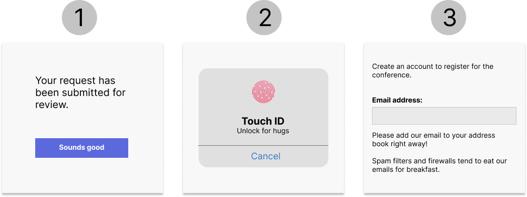
In example 1, the button uses a more informal ‘sounds good’ rather than the usual ‘continue’ or ‘ok’.
In example 2, the app seems to be trying to elicit a positive emotional response from the user with the text ‘unlock for hugs’.
In example 3, the text about firewalls eating emails for breakfast appears to be a way of encouraging users to add the email address to their address book.
How do these make you feel?
I’m sure each of you will have a slightly different response. Some of you will like this approach, others will hate it and most people are probably somewhere in the middle.
Divisive content
To me, this immediately highlights one of the main dangers with this type of content — it’s divisive. While as designers we should be creating content that works for the widest number of people possible, this will be fine for some people but could completely alienate others.
For example, some folk (especially autistic people) will have issues around sensory stimulation and will not like hugs, especially from people outside their family and friends. So the thought of getting a random hug could fill them with terror. Surely that’s not the sort of response the app designers are aiming for?
I find the content around adding an email address to your contacts particularly baffling. Many people will not have a clue what a spam filter or firewall is and the metaphor about emails being eaten for breakfast could confuse or alarm them. Many neurodiverse people find metaphors hard to understand as their brains are wired to be more literal, so this sort of content could be problematic.
For me, not designing with accessibility and inclusion in mind is a massive problem. Just imagine the outcry if a school refused to accept children with different learning styles — but bad design can be just as discriminatory.
Government perspective
As a user-centred design practitioner, I always turn first to Government Digital Service (GDS) guidance.
Their advice is not to use informal, humorous language — like ‘oops’ in an error message. They also say that friendliness can lead to a lack of precision. For example, consider buttons saying ‘continue’ or ‘well done, now let’s continue to the next section’. The latter is friendlier but also a lot longer.
GDS suggests that content should be serious but not pompous, and also emotionless. In practice, this means minimising adjectives as they can be subjective and make the text sound more emotive and like spin. For example, compare these 2 approaches to introducing a video:
‘Jo Smith explains the importance of effective communication’.
‘The incomparable Jo Smith eloquently explains why it’s a great idea to communicate effectively’.
The latter sounds like an awards ceremony introduction — and uses a lot more words (which not everyone will necessarily understand).
It’s important to remember that GDS advice is based on loads of evidence — so to deviate from it without good justification is dangerous.
The GDS rules are aimed at people writing government guidance and creating government services. For these, you can understand why the content should be written in such a neutral way as you would not want anything to get in the way of the end-users understanding what they need to do as quickly as possible.
Some types of content, such as e-learning, do potentially give us the opportunity to carefully introduce some greater variety into the content we create. There’s also more scope to be conversational — as we’re not just giving information but also putting it in context and making it memorable.
For instance, in a piece of government guidance, you might tell users to use government security classifications on documents. But in a related piece of e-learning, you would want to explain why the classifications are important and cover what could happen if you forget to use them. So you might write in a different (perhaps more enthusiastic) tone to convey your messages more forcefully.
Pitfalls of personality
Organisations or services which use a more informal approach to communications only do so after extensive research, as the risk is that for every user who appreciates the informality or humour, there is another who is put off by it. For example, the MailChimp tone guidelines caution that ‘forced humour can be worse than none at all. If you’re unsure, keep a straight face.’
A blog about hurdles to using humour in e-learning stresses that we need to avoid content that makes online learners feel uncomfortable, for example, if they do not understand a particular joke or pop culture reference.
Often the topics we work on are interesting enough that we do not need to make content more interesting with simulated personality.
Four dimensions of tone of voice
The Neilson Norman group did a piece of research to help companies decide on the appropriate tone of voice for their online content.
They identified 4 primary dimensions. These were:
- funny vs serious
- formal vs casual
- respectful vs irreverent
- enthusiastic vs matter-of-fact
Let’s think about how we could apply these dimensions to a single message — in this case, a user who has completed a section of an online course and is ready to move on to the assessment.
Serious/formal/respectful/matter-of-fact — “You have now completed this section of the course. The next part will be the assessment”
Serious/casual/respectful/enthusiastic — “You’re now done with this part of the course. Hope you’re ready for the test!”
Funny/casual/irreverent/enthusiastic — “Awesome work dude! You’re really smashing this. Now’s let test what you know — sure you’ll ace that like Novac Djokovic”
Obviously there are loads more possible combinations but you get the drift.
You can see that a more informal tone uses contractions (‘you’ve’ rather than ‘you have’) and generally shorter, more conversational words.
The content aiming to be funny has used wordplay, in this case, a pun about ‘acing’ the assessment. But humour is incredibly subjective and this is the most dangerous dimension as it’s so easy to put users off. The pun about Novac Djokovic is unlikely to be understood by anyone who’s not a tennis fan. And even if they are, with his anti-vax views, he’s at best a controversial figure.

Enthusiasm can also be a hard one to get right with written content. If you’re talking to a friend, you can tell when they’re enthusiastic about something by their voice and body language as much as what they’re actually saying. But with the written word, it’s easy for enthusiasm to come across as a bit flippant and juvenile. I personally would never use an exclamation mark, for instance, as it immediately gives the impression of jokiness or forced excitement.
The GDS approach would be serious/casual*/respectful/matter-of-fact and I feel that this is almost always the right approach for us as content designers doing public sector work, regardless of the type of content we’re producing.
* within sensible limits.
Sprinkling magic dust
Monzo online bank is known for its informal tone of voice. They particularly strive not to come across ‘like a cold, faceless organisation’. They have some really good advice (and lots of examples) about the importance of speaking your audience’s language.
Interestingly, they also suggest ‘sprinkling a little magic dust’ over your content — which to them means using exclamation marks, emojis and superlatives (like ‘great’ and ‘awesome’). Though they do caution that overuse can make the content seem insincere.
I imagine they arrived at this position after extensive user research and my concern would be that replicating this in public sector content would be difficult. While you might be happy to be told it’s ‘awesome’ that your salary went into your bank account, a similar message when engaging with a government service to pay child maintenance or apply for universal credit could seem rather crass.
Of course, it’s important to note that Monzo users have a choice of bank. So if you happen not to appreciate their ‘magic dust’ you can bank elsewhere. Users of government services or e-learning do not get a choice so it’s more important to create content that works for everyone.
Authentic content
I think that producing content with ‘authenticity’ is a better approach than trying to inject it with some sort of pseudo-personality.
Authentic content:
- is based on the needs and preferences of our users
- finds your tone of voice and uses it consistently
- reflects the nature of the subject matter
- is based on the real experiences of subject matter experts
- is engaging without being flippant, condescending or patronising
Video content can be a great way of creating engaging content which has authentic character.
The main takeaway message from some user research I carried out recently was that ‘serious content requires serious treatment’ — so try not to get carried away with jokes — or exclamation marks!
My final advice would be: if in doubt, follow GDS style and test any deviations with users to check you’re not alienating anyone by accident.